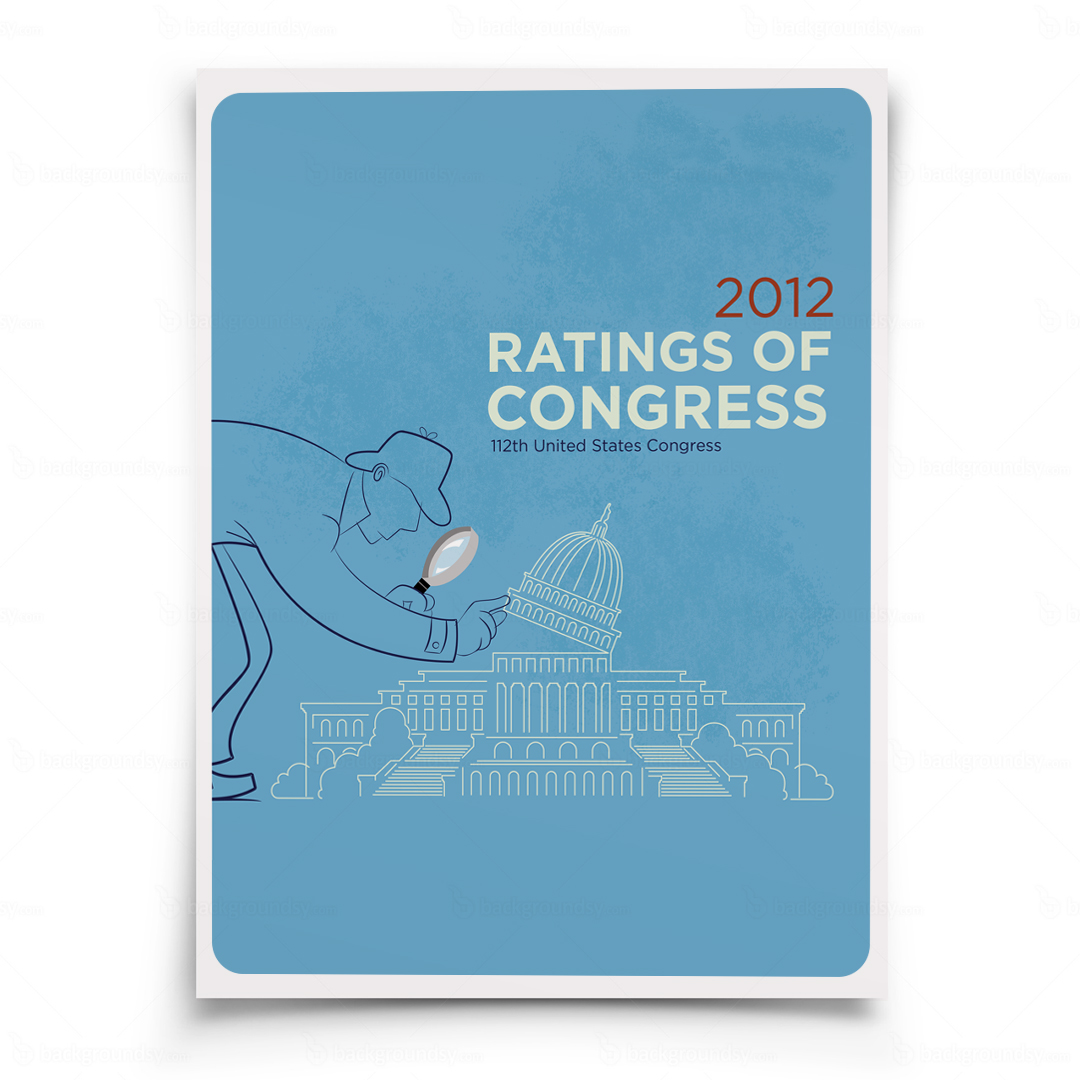
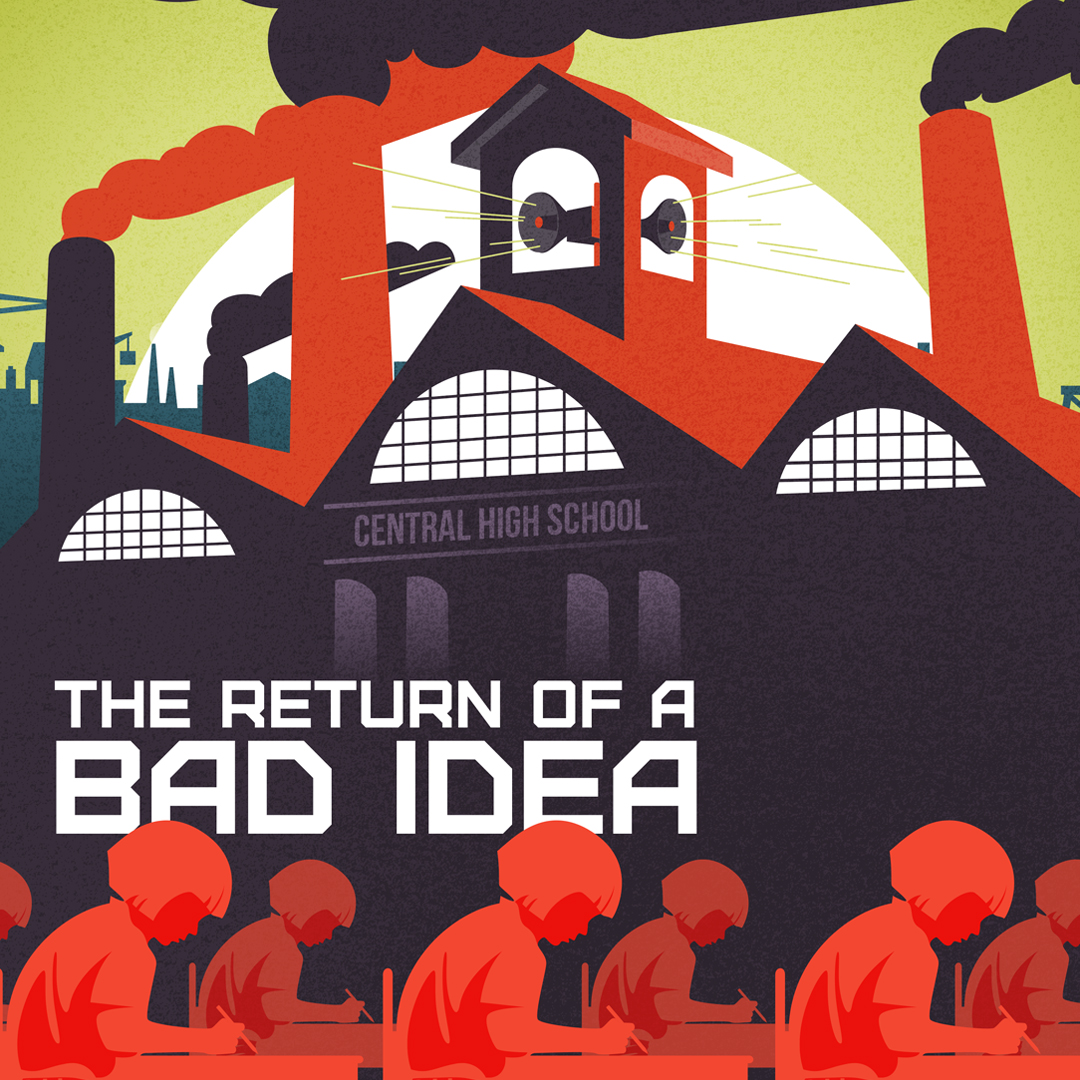
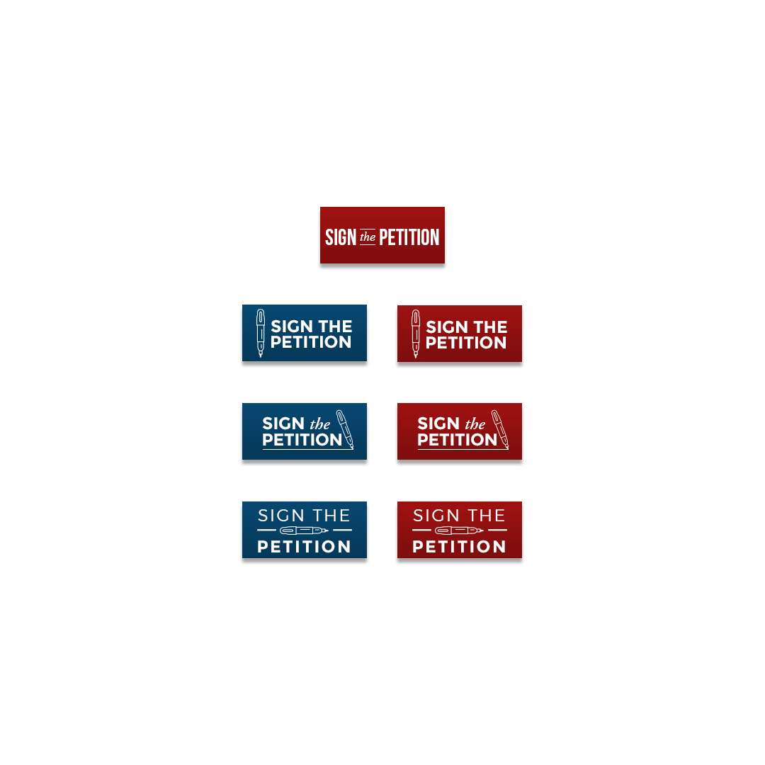
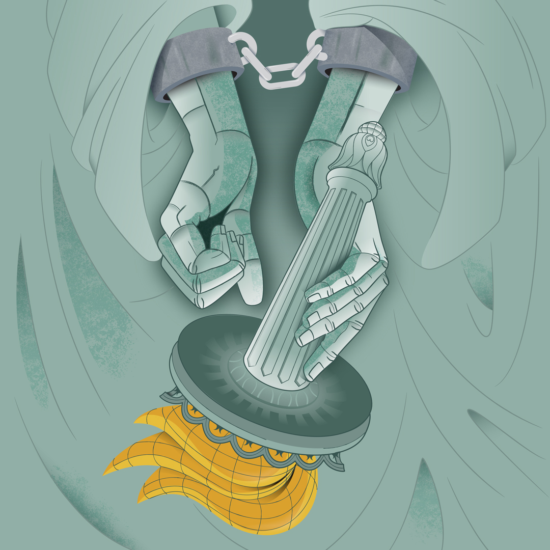
When I was asked to created a presentation background for a “prezi”, my first response was, “what’s a prezi”. If you haven’t seen it before, check it out. It’s a new spin on creating dynamic presentations. No more fooling around with slides in powerpoint. With Prezi, you can zoom, scroll and pan around one large canvas. After my 3 minute education via Prezi’s video I got straight to work. The theme of the presentation was the “gears of liberty” and after our initial discussion we agreed that the statue of liberty was the best representation. However, after a disastrous first attempt (no, I’m not posting the image, it’s NOT pretty) the client suggested using the United States. I went back to the drawing board with a clearer picture of what they wanted. I found a fantastic photo of a dismantled watch that I used for the gears. I chopped up images of vintage Stanley Steam engines, steam trains and even souped up Hondas. It was like Orange County Choppers, only on the computer in Frederick county, by a geek with lame facial hair. Yeah, I thought 100+ layers was pretty impressive, until I saw this.
Tags: clockwork, engine, gears, gears of liberty, mechanical, photo illustration, steampunk, steampunk united states
Posted in Design | No Comments »
Like many high school kids, I had absolutely no idea what I wanted to do after graduation. One of my best friends was headed for the Marines, and I thought, the Marines are cool, and I like their logo. (I once chose a school to attend based solely on it’s logo & mascot. That didn’t work out well either). I told my buddy that I might be interested in joining up with him, and he signed me up for a weekend boot camp for high school graduates considering a career in the military. Have you seen my resumé? Yeah, there’s no military service record on there. That little weekend getaway convinced me (rather quickly) that I was not cut out for it. I decided instead to draw pictures. However, the affinity for the Marines still remained and 20 years later our paths crossed once again. I got a call from Gannon Beck, an amazing illustrator and founder of Oo-Rah.com, a community that gives Marines a place to reestablish themselves with, and remain part of the Marine Corps community. He had seen my “Dont Tread On Me” poster and asked if I would be interested in designing another version for t shirts. I was sketching before we even hung up!

Rather than trying to redesign the exact image of the coiled snake on the Gadsden Flag, I decided to take the three coils and re-imagine them. I did a version from the side and two different concepts head on. Since the audience is the Marine Corps I decided to wrap the snake around the Marine’s famous sword. The “banner” design was ultimately chosen and is slated for t-shirts as well as challenge coins.

Tags: coiled snake, Design, dont tread, dont tread on me, DTOM, DTOM logo, DTOM redesign, gadsden, Illustration, Marines, snake, snake illustration, USMC
Posted in Illustration | No Comments »
I was absolutely thrilled when I found out that Refresh was coming to Winchester. I had previously been driving in to D.C. So you can only imagine how excited I was when asked to design the logo for it. For those not familiar with the area, Winchester is located at the northern most tip of Virginia. At only 15 miles from the West Virginia line, it’s the gateway to the Shenandoah valley in Virginia. It’s also well known for apples They grow in abundance here. Whitehouse Foods (the apple sauce company) is headquartered here and every spring Winchester hosts the Apple Blossom Festival. So it was no surprise that an apple had to be a part of the concept. The instructions I received stated that the refresh logo must contain the word “Refresh” along with the city name, and the refresh icon.

The hardest part of designing the logo using the apple theme, was trying to set it a part from Apple. While working on the logo I kept wondering if audiences, not familiar with refresh would think this was only geared towards apple users. I have no idea if this played into the decision to scrap these initial concepts by the client. While they were well received, the client was a bit leery of using the apple, and even seemed to think twice about centering the logo around it.
Round two saw the apple pared down to only a slice. These concepts were overwhelmingly well received as it negated the apple concerns and looked like it belonged among the other Refresh chapters. However there was the issue of the refresh “icon”. Since they were happy with the apple slices as they were, adding the icon to them was not an option. So, I decided to play with the text. I choose “Rezland” for the main font because of it’s clean, round, modern feel. The “E’s” made perfect circles, so I chopped the diagonal line and added arrows to form the refresh icon. Another clean san-serif font, “Engravers Gothic” was chosen for the secondary font on the city name. I pulled in the red from the apple and left the “e-icons” black.
The final apple slice was decided upon with one minor tweak; loose the shadow. With that change made, the new text was added and the logo was complete. You can see the final logo in action here: www.refreshwinchester.org

Tags: apple slice, apples, Design, Illustration, logo, logo design, logos, refresh, refresh winchester, slice logo, winchester
Posted in Design, Illustration | No Comments »

More than a year ago I scratched out a very rough sketch of a cat pawing into an aquarium for a snack, and subsequently being pulled in by a huge octopus. It was an idea I had to illustrate the idiom “curiosity killed the cat”. That sketch got filed away in an ever increasing pile of “eventual-projects-to-get-to-when-I-have-the-time”. A couple of months later I caught my son giggling away while snooping through that pile. When I asked him what was so funny, he handed me the sketch of that cat about to be devoured as a result of it’s own curiosity. He loved it, so I decided to move it to the top of the pile. That is how curiositykillz.com was born.

I decided to expand the idea into a series of 9 illustrations depicting the lives of 9 different cats. Back stories were researched and developed. I presented the idea to my good friend, and amazing web consultant, Corey Brown, who jumped on board and began coding the site that I had designed.

I want to make something perfectly clear, curiositykillz.com is in no way meant to glorify the death or harming of animals. I’m hoping it’s clear that my tongue is firmly planted in my cheek by the over-the-top stories and illustrations. However there are those who won’t “get it” or don’t think it’s funny. In fact one website has refused to carry the merchandise as they deemed it “offensive”. In our family we have four cats (and a dog along with two fish), and this series of illustrations was born out of love for those cats and an observation of their insane behavior. I personally know the benefits that pets bring to our lives and how important they are.

You can follow curiositykillz on twitter or you can become a fan on Facebook
Posted in Uncategorized | No Comments »
I recently posted the logo I created for the 2010 conference held in Chicago. Below is the promo poster I just wrapped up for display at this years conference.

Tags: chicago, chicago at night, chicago poster, chicago skyline, promotional, skyline
Posted in Design | No Comments »
I was recently requested by American Majority to updated the famous “Dont Tread On Me” Gadsden flag of the coiled snake, using the two colors from their logo for posters they wanted to get printed. My instructions were to update it as much as possible while retaining the feel of the original. With these instructions I decided to “trace” the original and tweak it in Illusrtator, rather than completely redrawing it.

While trying to figure out how best to work in the second color I noticed the snake’s belly was a different element as the rest of the snake. While the top lines run the length of the snakes body, the lines on his belly run around the snake in the opposite direction. This gave me the idea to “break” the snake apart making a “top” and “bottom” allowing for the two colors, and since the “star” is a major element to their logo, I added stars to the tail to form the rattle.
Once the initial illustration was done (A), I turned off the background layer and filled everything. I noticed that it looked a little bit like a spring jumping off the ground, so in order to make it look more like it was sitting on the ground, I “squashed” the bottom coil and brought the section before the tail into view. I continued to tweak different areas of the snake that formed Escher-esque impossibilities, like the point on the top portion just under the neck.

Once I was happy with the final illustration (B), I added in their logo colors.

After color was applied, I brought it into Photoshop and placed it on a parchment background I had created for them on a previous job. I played around with different layer effects until I got the desired effect I wanted. Unfortunately, it shifted the colors so badly that I had to create a second background in greyscale to apply the snake onto. A layer mask was then added to hide the grey background and reveal the parchment. The words, and logo were then added to complete the poster.
Posted in Illustration | No Comments »

When I approached the design for the 2010 Leaders Conference host city logo, I knew almost immediately that I wanted to work Chicago’s unique skyline into it. After several failed, “Frankenstein-esque” attempts, I decided to form the letters from the negative space created between the buildings. This worked really well for the “H, I and A” since they have straight or angled lines, however the “C’s G and O” posed a problem. Adding depth and detail to the buildings allowed me to tie those into the curved forms of those letters, with the exception of the “O” which was left hanging out on the end. I decided the best option to tie it in with the rest of the logo was to “link” it with the “G”. I went with a cold color scheme to match the city skyscrapers and added a touch of “grit” and shading.
Tags: chicago, chicago logo, chicago skyline, chicago skyline logo, Design, Illustration, logo for chicago
Posted in Design | No Comments »

No, not the old 2005 Daniel Powter song (although it’s been playing in the back of my head since I started this post). I’m sure I was subconsciously inspired by Pixar’s short “Partly Couldy” (the one shown before “UP”) when I had this thought about happy clouds floating along until one storms by in a really bad mood. As he spreads his lack of cheer around, the other clouds just try to stay outta his way. I wonder if Bob Ross ever painted “happy clouds” to go along with his happy trees. (for personal use)
Tags: bad day, bad day concept, bad mood, clouds, cloudy, Illustration, lightning, partly cloudy, rain, rain cloud, thunderstorm, thunderstorm cartoon, thunderstorm drawing
Posted in Illustration | No Comments »
I’ve long been a fan of high contrasting black and white design. When done properly they can create an optical illusion of sorts as our minds begin to fill in what’s “missing”. They’re stark, bold and make the statement: “I will not be ignored”. Add in a splash of red and you’ve got a guaranteed captive audience. Recently, I was asked to design a logo similar in style to the Oceans Eleven poster. While researching, I noticed this tried-and-true formula has been used for years in designing movie posters. Below are some of my favorite examples. Feel free to add any suggestions I may have missed!

Amazing poster, for an amazing film!


I love the way this “updated” version plays off the original but using simple “cut outs”.


Not the official movie poster, but I loved how it tied all of the Bond movies together using the iconic swirled circle “eye” and silhouette of 007.


Love the hint of red on the small red rose.


Ok, not red, but in the same family.


Quite possibly the best example of them all.


Frank Miller is a master artist and storyteller, and his masterpiece is Sin City. I would race to my local comic store to pick up the next issue. I couldn’t take my eyes off his artwork. The movie was a nice homage to his work.

Tags: , best black and white movie posters, black & white, black and white, black and white designs, Design, graphic, movie posters, movies, posters, stark bold
Posted in Design | 5 Comments »