Save the United States

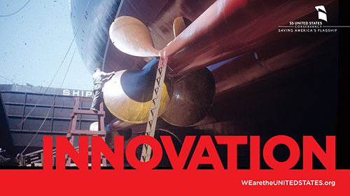
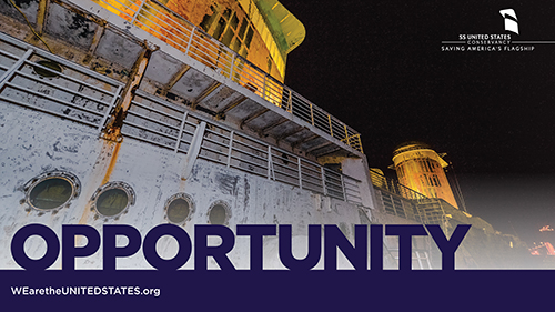
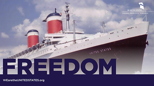
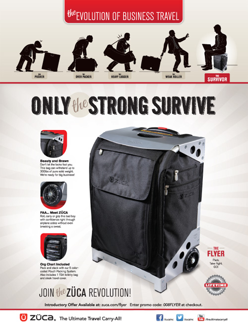
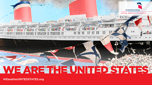
Resilience, dedication, courage, diversity, opportunity, freedom and innovation. These are words that describe the United States. You don’t have to be steep into politics to know that we are a divided nation. Perhaps we have been for many years, but the words listed above are words we can all agree on to describe the United States, and it’s these words that I was provided to create the look of the campaign to save the USS United States. Personally, I had never heard of the United States. When my client provided me with a link to the media I would require to complete the campaign, I spent hours looking through the old photos, watching the faded news reels. I saw black and whites of celebrities from times gone by, and faded color photos of families waving from the decks of the ship to the docks below. Then I came to a folder titled “recent photos”. Here were scores of images of what looked like something from an urban explorers trip into an abandoned shipwreck. Paint was peeling, rust and decay were slowly taking over the ship, creeping along metal railings. It looked like a ghost ship. Like the photos of the Titanic sitting on the ocean floor, but this ship was docked in New York. I realized, I was part of something important and extraordinary. I was asked to help do a very small part to save a piece of history. Unfortunately, many of the photos were of very poor quality, and like the ship in need of repair. Most of the images only needed small repairs, of quick photoshopping to remove creases, or flaking edges. One image though, became the face of the campaign. It was of the ship coming into dock, crowds cheering, and flags waving. The original image was in black and white, however I colorized it, like an old Ted Turner classic. I’m super proud of this campaign, and I’m grateful that I got to be a part of it. If you’d like to see all of the images I created, read facts about the ship and check out a short video, you can view the campaign here: https://www.wearetheunitedstates.org/campaign

The evolution of business travel

Zuca makes really cool luggage. A favorite of makeup artists for years, they have drawers and a sturdy exoskeleton you can sit on. They wanted to expand their market and reach high end business travelers. I was contacted by the Los Angeles based ad agency they had hired, to create an illustration to be used in an ad. The logo I had created for the mechanics (Paul Revere on horseback) had caught the agency’s attention, and it was the style they wanted to follow. My instructions were to mimick the evolution chart, and in each stage have the traveler experiencing some form of pain and suffering due to their luggage. They envisioned two different concepts, one that followed the traditional horizontal chart, and another that was more dimensional.

evolution sketch Evolution2


Once the sketches had been approved, I finalized the silhouettes in Illustrator.

horizontal evolution

Evolution Concept2

Here’s a couple  close ups of some of the stages.

Stages 1-3Stage 1 REVISED

stage2

Stage 4 Horizontal

And here’s a look at the final ad.

ZUC101-Strn Surv-v5-FINAL-HR

ZUC101-Strn Surv-v5-FINAL-HR

© 2013 Zuca and Thoburn Design & Illustration


Curiositykillz 2.0

The first pet I ever owned was a cat. I found him in a dumpster behind our local Little Caesars pizza place. After he died I went out to get another and ended up with four. I love cats! I think they’re great, and back in 2009 they served as the inspiration of a personal portfolio website I launched called “CuriosityKillz.com”. It was originally intended to be a portfolio site that featured 9 different humorous illustrations of cats doing something curious moments before they’re deaths. It sounds worse than it really was. There was a monster in the closet, and a cat pressing a self destruct button on a the space station, really far fetched, silly illustrations. Still, there were those who found absolutely no humor in it whatsoever, including the anonymous poster who threatened me with physical harm and death (no, I’m not kidding). If you’re interested you can read my original post about the site here.

cat_4cat_9

The site sat dormant for two years dying a slow death (pun absolutely intended). Recently, I was persuaded to enter an international comic strip competition. I was interested, but had no idea what I could use as my subject matter. Then it hit me, Curiosity Killz would be perfect. I decided to completely scrap all of the original illustrations and change the entire concept. Rather than create single panel full colored artwork, I’d turn it into a 3 panel comic that followed the same theme for every single comic. Cat’s sees something curious, that curiosity gets the best of him, cat dies. The original site featured a smoking cat and this would serve as my first comic.

smoking

Before long I had come up with over 50 ideas (and was still writing down more on the backs of each comic). It is my intention to publish all of these comics, as often as I can get them done, to the newly redesigned CuriosityKillz website. So go check it out and be sure to bookmark it so you can check out the latest comic.

As for the competition, it starts on Monday February 11th and can be found here.