I received a call from an ad agency in Dallas asking me if I’d be interested in taking on a logo project. After I agreed, they informed me that I was one of a couple different artists selected to work on a new logo for Borden. Borden, founded in 1857, is one of the top ten largest companies in America. They were considering updating their logo and were especially interested in my silhouette style logos, specifically, the Mechanics Program. Elsie, the company’s mascot has been through numerous revisions over the years.

The first thing I set out to do was simplify Elsie’s face. I tried two completely new ideas, opting for a head-on view and a third based off their current three-quarter view.

They felt the first two deviated too far from the original, whereas the third version was closer to what they were looking for. I added in some very simple daisies, and experimented with how it would work reversed on a solid background.

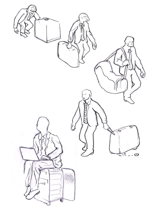
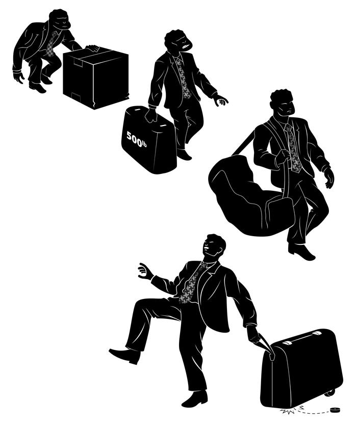
With the head completed, I moved on to Elsie’s body. As you can see from the samples through the years, Elsis’s never had a full body. I thought this would be a perfect opportunity to experiment with the idea of giving her one. So I played around with several different poses.

All were very well-received, but they were only interested in proceeding with the fourth, less anamorphic sample. This time they wanted it even simpler. They instructed me to completely strip the details in the face, and all the shading. I provided one final sample before the project came to a halt (the colors were randomly chosen to show contrast).

The client ultimately rejected the idea to revise their logo, and decided to stay with their current one. If you’re interested, Chris Whetzel (another artist selected to work on this project), has a similar blog post on his creative process. I really loved his interpretation, it’s a very nice update.