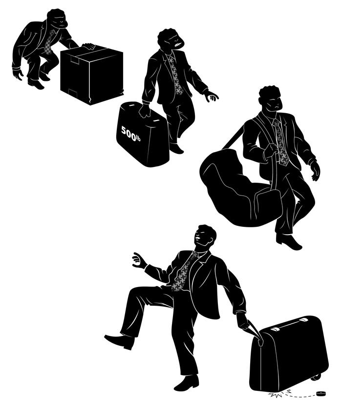
Zuca makes really cool luggage. A favorite of makeup artists for years, they have drawers and a sturdy exoskeleton you can sit on. They wanted to expand their market and reach high end business travelers. I was contacted by the Los Angeles based ad agency they had hired, to create an illustration to be used in an ad. The logo I had created for the mechanics (Paul Revere on horseback) had caught the agency’s attention, and it was the style they wanted to follow. My instructions were to mimick the evolution chart, and in each stage have the traveler experiencing some form of pain and suffering due to their luggage. They envisioned two different concepts, one that followed the traditional horizontal chart, and another that was more dimensional.
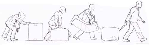
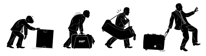
Once the sketches had been approved, I finalized the silhouettes in Illustrator.
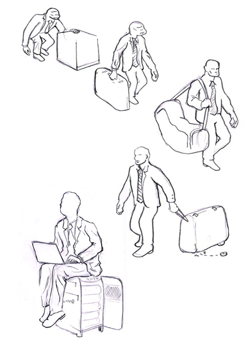
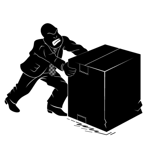
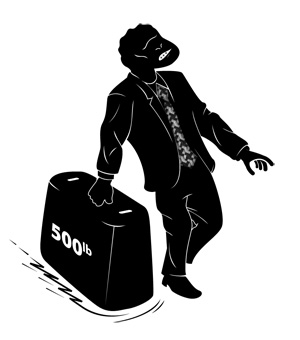
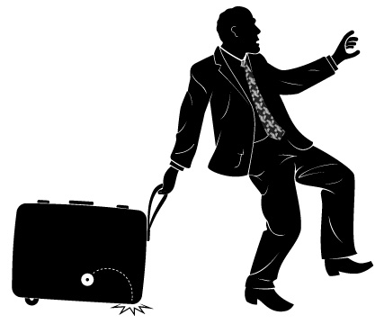
Here’s a couple close ups of some of the stages.

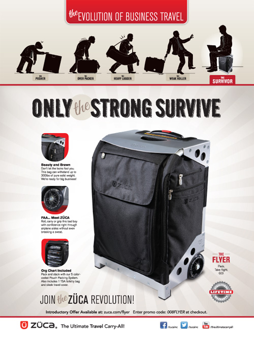
And here’s a look at the final ad.


© 2013 Zuca and Thoburn Design & Illustration


 The original illustration lines were dropped on top and a layer style was applied just to help the edges pop. Once I had finished it in Photoshop, the left side felt a little empty, so I added in a dead tree, and a murder of crows. I left room at the top for the mast head and along the right side for the mailing address. This was presented to the client as my final draft which they were thrilled with. Best of all there were no changes needed. Final approval was given and they were sent off for printing. I was really quite happy with the final product once it arrived.