
Tag: Illustration
GeoEngineering

Editorial illustration for Momentum Magazine which is published by the University of Minnesota’s Institute on the Environment.
Don’t Tread On Me part II
Like many high school kids, I had absolutely no idea what I wanted to do after graduation. One of my best friends was headed for the Marines, and I thought, the Marines are cool, and I like their logo. (I once chose a school to attend based solely on it’s logo & mascot. That didn’t work out well either). I told my buddy that I might be interested in joining up with him, and he signed me up for a weekend boot camp for high school graduates considering a career in the military. Have you seen my resumé? Yeah, there’s no military service record on there. That little weekend getaway convinced me (rather quickly) that I was not cut out for it. I decided instead to draw pictures. However, the affinity for the Marines still remained and 20 years later our paths crossed once again. I got a call from Gannon Beck, an amazing illustrator and founder of Oo-Rah.com, a community that gives Marines a place to reestablish themselves with, and remain part of the Marine Corps community. He had seen my “Dont Tread On Me” poster and asked if I would be interested in designing another version for t shirts. I was sketching before we even hung up!

 Rather than trying to redesign the exact image of the coiled snake on the Gadsden Flag, I decided to take the three coils and re-imagine them. I did a version from the side and two different concepts head on. Since the audience is the Marine Corps I decided to wrap the snake around the Marine’s famous sword. The “banner” design was ultimately chosen and is slated for t-shirts as well as challenge coins.

Refresh Winchester
I was absolutely thrilled when I found out that Refresh was coming to Winchester. I had previously been driving in to D.C. So you can only imagine how excited I was when asked to design the logo for it. For those not familiar with the area, Winchester is located at the northern most tip of Virginia. At only 15 miles from the West Virginia line, it’s the gateway to the Shenandoah valley in Virginia. It’s also well known for apples They grow in abundance here. Whitehouse Foods (the apple sauce company) is headquartered here and every spring Winchester hosts the Apple Blossom Festival. So it was no surprise that an apple had to be a part of the concept. The instructions I received stated that the refresh logo must contain the word “Refresh” along with the city name, and the refresh icon.

The hardest part of designing the logo using the apple theme, was trying to set it a part from Apple. While working on the logo I kept wondering if audiences, not familiar with refresh would think this was only geared towards apple users. I have no idea if this played into the decision to scrap these initial concepts by the client. While they were well received, the client was a bit leery of using the apple, and even seemed to think twice about centering the logo around it.
 Round two saw the apple pared down to only a slice. These concepts were overwhelmingly well received as it negated the apple concerns and looked like it belonged among the other Refresh chapters. However there was the issue of the refresh “icon”. Since they were happy with the apple slices as they were, adding the icon to them was not an option. So, I decided to play with the text. I choose “Rezland” for the main font because of it’s clean, round, modern feel. The “E’s” made perfect circles, so I chopped the diagonal line and added arrows to form the refresh icon. Another clean san-serif font, “Engravers Gothic” was chosen for the secondary font on the city name. I pulled in the red from the apple and left the “e-icons” black.
 The final apple slice was decided upon with one minor tweak; loose the shadow. With that change made, the new text was added and the logo was complete. You can see the final logo in action here: www.refreshwinchester.org

2010 Chicago Logo
![]()
When I approached the design for the 2010 Leaders Conference host city logo, I knew almost immediately that I wanted to work Chicago’s unique skyline into it. After several failed, “Frankenstein-esque” attempts, I decided to form the letters from the negative space created between the buildings. This worked really well for the “H, I and A” since they have straight or angled lines, however the “C’s G and O” posed a problem. Adding depth and detail to the buildings allowed me to tie those into the curved forms of those letters, with the exception of the “O” which was left hanging out on the end. I decided the best option to tie it in with the rest of the logo was to “link” it with the “G”. I went with a cold color scheme to match the city skyscrapers and added a touch of “grit” and shading.
Bad day
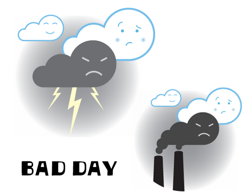
No, not the old 2005 Daniel Powter song (although it’s been playing in the back of my head since I started this post). I’m sure I was subconsciously inspired by Pixar’s short “Partly Couldy” (the one shown before “UP”) when I had this thought about happy clouds floating along until one storms by in a really bad mood. As he spreads his lack of cheer around, the other clouds just try to stay outta his way. I wonder if Bob Ross ever painted “happy clouds” to go along with his happy trees. (for personal use)