Updated portfolio to include several projects from the later half of 2010.
Dogs were the inspiration for two different logo assignments. These logo concepts were ultimately rejected for much simpler designs.


Updated portfolio to include several projects from the later half of 2010.
Dogs were the inspiration for two different logo assignments. These logo concepts were ultimately rejected for much simpler designs.
The Bass Coalition is a summer workshop for Bass players and enthusiasts. One of their sponsors, NoTreble contacted me and asked if I could design a logo for the coalition. One of the biggest challenges that they mentioned was that it needed to appeal to both kinds of bass players, classical and electric. I was told that it could be edgy, but not too edgy. I wasn’t sure where to start, so I went to Google images and searched for “bass player” which brought up an array of images including someone playing a fish (humorous but not helpful). Rather than trying to jump the “two types of players” hurdle right away, I thought about music and how best to illustrate it. I saw a smooth flowing continuous line. I decided to create a logo of a classic bass player using that continuous line. Felix Sockwell is THE master of this art form and after my experience I bow to his awesomeness. If you’re not familiar with his work, check it out. I scribbled out at least 6 different sketches attempting to pull it off. I ended up mashing all six together and was surprisingly happy with the result.
 For my second concept I decided to once again play with the negative space, by using the player to form the “empty” bass. He looked like some dude you’d see in a smokey club pluckin’ some jazz. Finally for my third concept I threw out the player and decided to feature the bass more prominently. by using the word to form the image.
Feeling confident that I had covered at least one of my bass’ (the classical one . . . dah-dum-CHING) I decided to try a more edgy concept that would appeal to both types of players. Using the universal hand sign for “Rock and roll” I placed the necks of each bass on the hand. Classical on Mr. Pointer and electric on Pinky. I thought it was edgy, humorous and most importantly functional.

While the client agreed and liked it very much, it, along with the others, was ultimately rejected. However one of them did appeal with some tweaking. We took the third concept and replaced the word “bass” by filling it in with a solid image. By filling this in it not only formed half of the bass it also created the first initial “B” in the title. I added the initial “C” where the f-holes would originally be. This concept was ultimately approved.

 When I was asked to design a logo for the “Mechanics” something very different immediately came to mind then the final result (All I need is a miracle began bouncing around in my head). Designing this logo required some digging into American History. In the days before the Revolutionary War, Paul Revere organized the Mechanics, a group of determined patriots that grew out of the Sons of Liberty. The group established an intelligence network that monitored the actions of the British army in Boston, and then sent news of the movements to patriot leaders. It was the Mechanics who discovered that British troops were planning to march on Lexington and Concord on the evening of April 18, 1775, which led to Revere’s famous midnight ride to warn Samuel Adams, John Hancock and other colonists that the British were coming. You can read more about that here. I decided a simple silhouette of Paul Revere on his famous midnight ride would best represent the organization and it’s mission which is to train, organize, and increase networking of the grassroots movement. While looking through several artists interpretations, I noticed most of them rendered Paul facing the viewer. I decided to do just the opposite, having Paul leading us away from the danger. While he’s pointing back towards the oncoming threat, he motions us forward in a call to action.

![]() Scot, a professional drummer well seasoned in multiple styles (roots rock, rock-a-billy, blues, classic soul, old school funk, redneck jazz, contemporary Christian music, all flavors of country – honky-tonk, alt and contemporary) asked me to create a logo for him. We had worked together in the past on some promo posters for his band “Oz Revue”. When he approached me about his logo he mentioned was that he wanted the drum imagery to be subtle. I love logos that creatively use negative space, so I decided to use his first initial as the main mark. The “S” would provide me with two negative spaces to play with. I used a circle to form the drum head and created the letter “S” by placing drum sticks in those negative spaces. Scot was thrilled with this first draft and we moved forward implementing the new mark on his marketing materials. You can find out more about Scot here. A new site to match the logo is coming soon.
Scot, a professional drummer well seasoned in multiple styles (roots rock, rock-a-billy, blues, classic soul, old school funk, redneck jazz, contemporary Christian music, all flavors of country – honky-tonk, alt and contemporary) asked me to create a logo for him. We had worked together in the past on some promo posters for his band “Oz Revue”. When he approached me about his logo he mentioned was that he wanted the drum imagery to be subtle. I love logos that creatively use negative space, so I decided to use his first initial as the main mark. The “S” would provide me with two negative spaces to play with. I used a circle to form the drum head and created the letter “S” by placing drum sticks in those negative spaces. Scot was thrilled with this first draft and we moved forward implementing the new mark on his marketing materials. You can find out more about Scot here. A new site to match the logo is coming soon.

I was absolutely thrilled when I found out that Refresh was coming to Winchester. I had previously been driving in to D.C. So you can only imagine how excited I was when asked to design the logo for it. For those not familiar with the area, Winchester is located at the northern most tip of Virginia. At only 15 miles from the West Virginia line, it’s the gateway to the Shenandoah valley in Virginia. It’s also well known for apples They grow in abundance here. Whitehouse Foods (the apple sauce company) is headquartered here and every spring Winchester hosts the Apple Blossom Festival. So it was no surprise that an apple had to be a part of the concept. The instructions I received stated that the refresh logo must contain the word “Refresh” along with the city name, and the refresh icon.

The hardest part of designing the logo using the apple theme, was trying to set it a part from Apple. While working on the logo I kept wondering if audiences, not familiar with refresh would think this was only geared towards apple users. I have no idea if this played into the decision to scrap these initial concepts by the client. While they were well received, the client was a bit leery of using the apple, and even seemed to think twice about centering the logo around it.
 Round two saw the apple pared down to only a slice. These concepts were overwhelmingly well received as it negated the apple concerns and looked like it belonged among the other Refresh chapters. However there was the issue of the refresh “icon”. Since they were happy with the apple slices as they were, adding the icon to them was not an option. So, I decided to play with the text. I choose “Rezland” for the main font because of it’s clean, round, modern feel. The “E’s” made perfect circles, so I chopped the diagonal line and added arrows to form the refresh icon. Another clean san-serif font, “Engravers Gothic” was chosen for the secondary font on the city name. I pulled in the red from the apple and left the “e-icons” black.
 The final apple slice was decided upon with one minor tweak; loose the shadow. With that change made, the new text was added and the logo was complete. You can see the final logo in action here: www.refreshwinchester.org

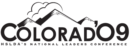
Every year I create an invitation for a non-profit organization’s national conference (not spec work). The invitation is typically 16-20 pages, 8.5×14 saddle stitched. It includes the typical conference stuff, like a brief write up on the host city or state, event schedule(s), guest speakers, registration forms and special sessions. Each of these special sessions require a logo of sorts. Below are three of logos I created as well one for the host state, Colorado.
![]()